
Meopta - optika, s.r.o.
A new website within strictly defined criteria.
After acquainting ourselves with the details and listening to the more specific requirements, we produced several possible solutions. Our final website presentation reflects the brand's quality, its comprehensive range and reliability.
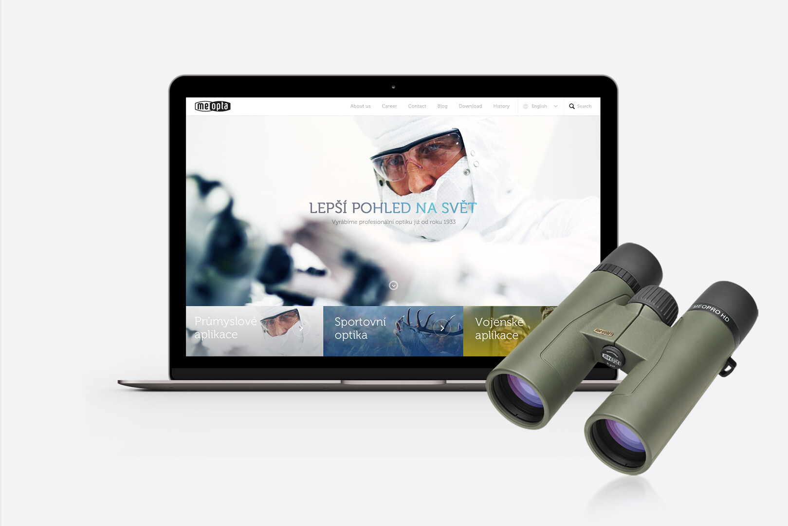
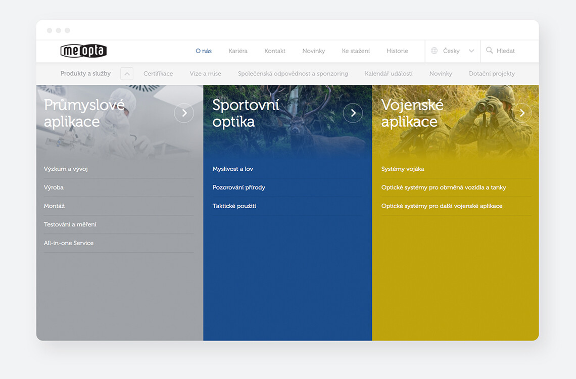
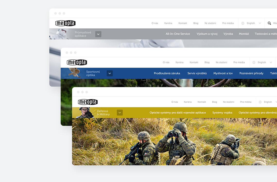
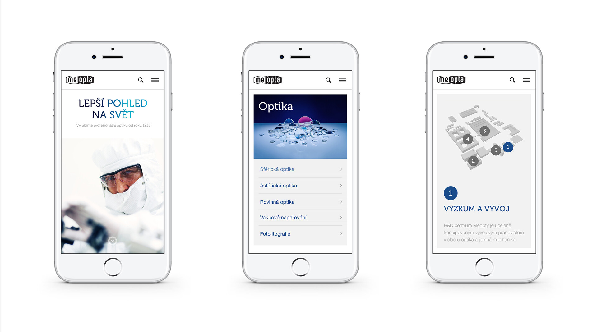
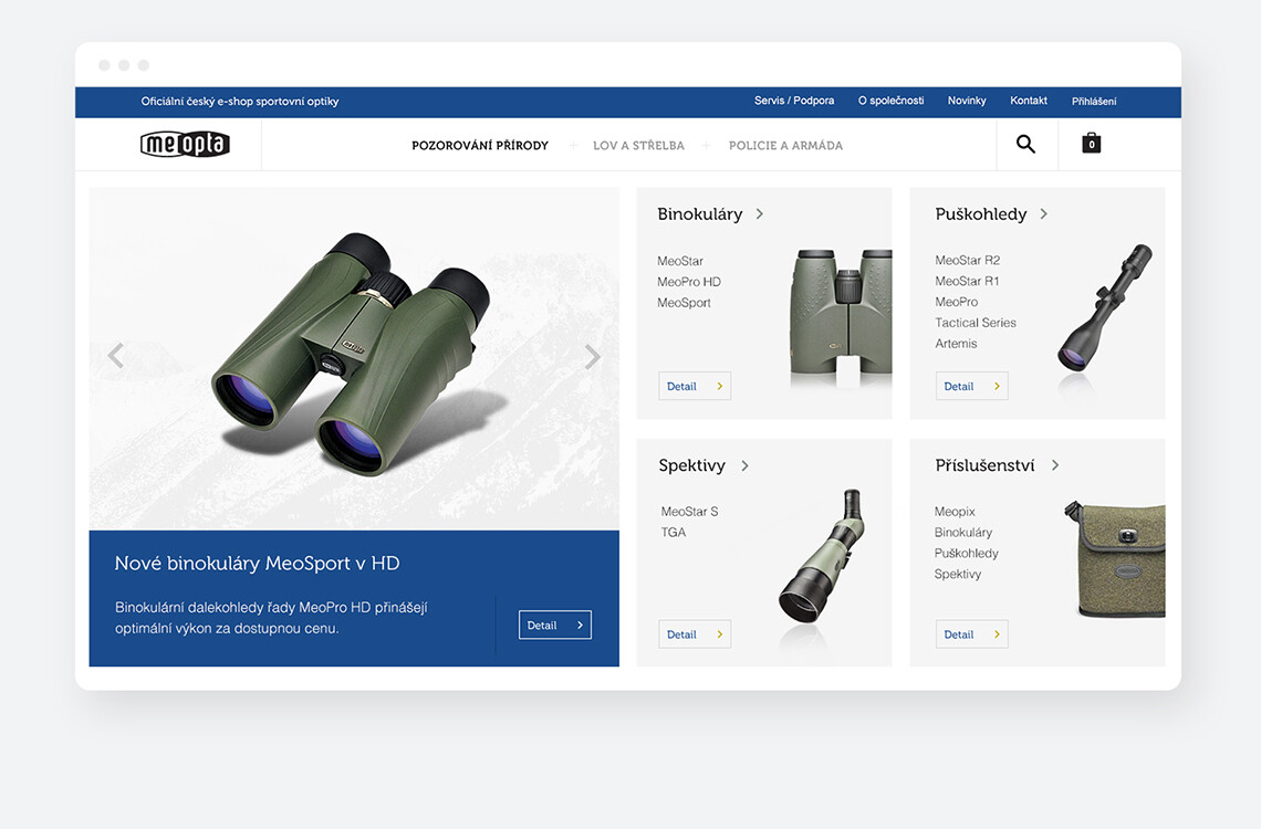
Meopta develops, manufactures and assembles world class optical, opto-mechanical and optoelectronic products. Meopta is at the vanguard of products and services to the industrial, military and consumer markets. Our daunting task was to unite the company’s diversity under one online presentation whilst maintaining defined individual fields. The design of the website, not only included a vast quantity of data, but also three very different target audiences. Even for an experienced agency such as ourselves this was challenging.
When designing the website and looking for a solution for to make it functional, we had to take into an account the diversification of the target group as well as a high number of different references. In the end, however, a clear structure was built and was integrated into a clean design.
Brief
The requirement was as following: To create a precise and functional website that would stress the professionalism and reliability of the Meopta company. The most important task was to go through
a large amount of text documents and create a comprehensive solution for the diverse product range and at the same time to ensure the clarity of the entire website.
Design of the website
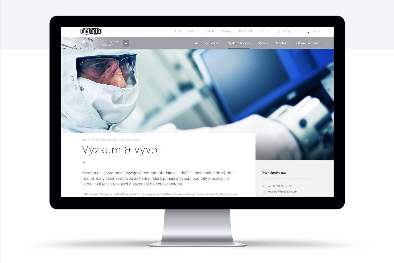
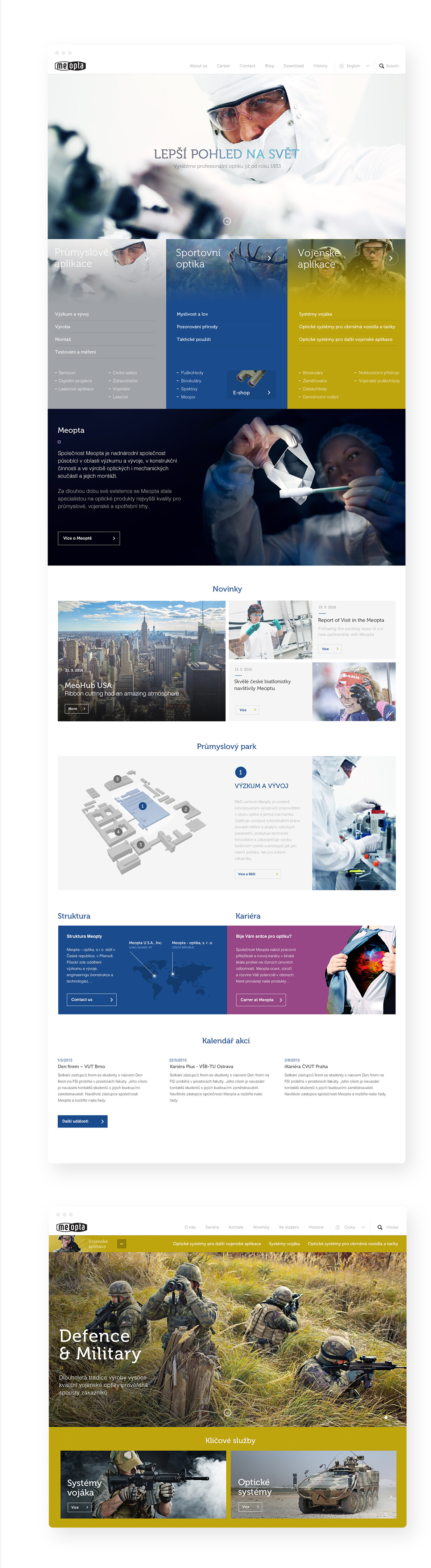
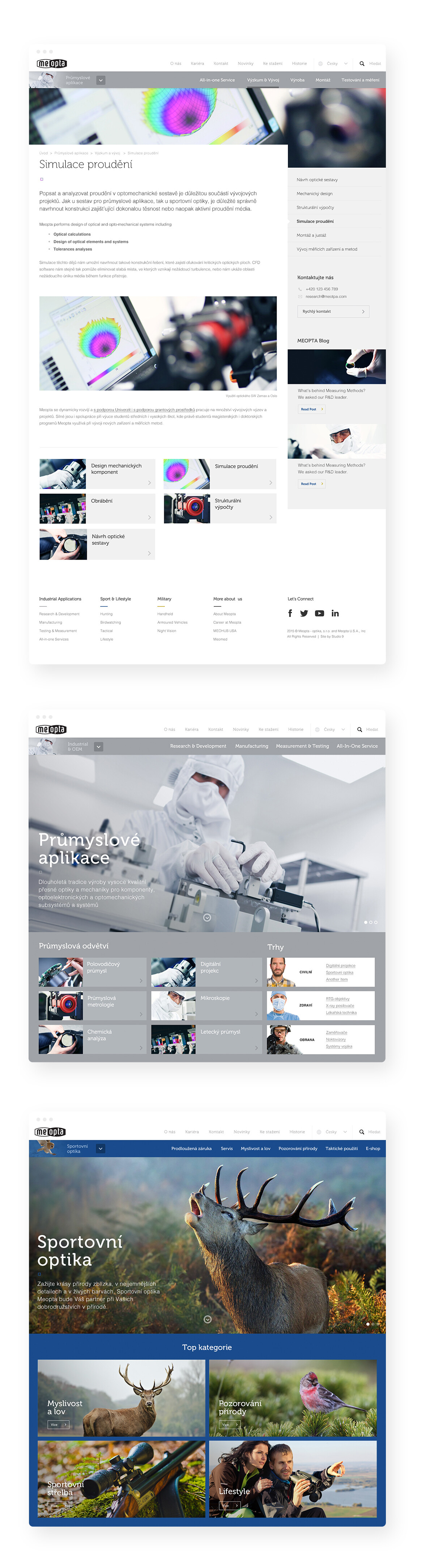
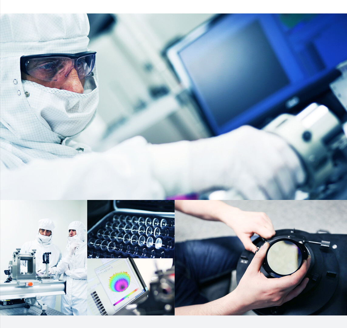
To balance the design of the entire website, we decided to use a simple colour scheme, reflecting the visual character of the company. The typography and layout as well as a basic set of colours create a unifying theme whilst a set of complementary colours become dominant in the various fields into which the company is divided. To support and reinforce this we carefully organised the photos to blend with the graphics, creating a logical and delicately balance visual combination that penetrates the entire website. The product images were created in our own photographic studio.
Without a perfectly thought-out UX, this could have been a very beautiful, but useless site. The functionality of the site required a great deal of attention - linking well-built structure and design. After several weeks of intensive cooperation, we arrived at an effective solution with clean strong graphic identity as well as a strong functionality.

Studio 9, from my perspective, is something between a web studio and communications agency, which is advantageous for clients in terms of the consistency and the complexity of the implemented projects. I feel compelled to mention the really great, professional team that had such a friendly and proactive approach. Our cooperation will certainly continue well into the future.
The team that created the redesign stated that the biggest challenge was the complexity of the project in terms of structure. Also for ease of administration, we prepared several new plugins that make the back-end of the site more user friendly.